Great Expectations
A wise doctor does not mutter incantat
ions over a sore that needs the knife.
授权协议
在使用字体时需要获取字体授权,具体授权包括:
 个人非商业授权
 商业发布授权
 出版物授权:针对出版物
 嵌入式应用授权
如果您的应用场景没有包含在这些授权形式中,请联系我们,我们将为您提供更多选择。
适用系统:Windows/Mac字库安装说明?
基础信息
- 字体品牌:
-
设计师:
Miedinger,Max
-
字体分类:
无衬线体
-
字体属性:
外文
-
字符集:
Unicode
-
发布时间:
2018

The quick brown fox jumps over a lazy dog
The quick brown fox jumps over a lazy dog
The quick brown fox jumps over a lazy dog
The quick brown fox jumps over a lazy dog
The quick brown fox jumps over a lazy dog
The quick brown fox jumps over a lazy dog
The quick brown fox jumps over a lazy dog
The quick brown fox jumps over a lazy dog
The quick brown fox jumps over a lazy dog
The quick brown fox jumps over a lazy dog
The quick brown fox jumps over a lazy dog
The quick brown fox jumps over a lazy dog
The quick brown fox jumps over a lazy dog
The quick brown fox jumps over a lazy dog
The quick brown fox jumps over a lazy dog
The quick brown fox jumps over a lazy dog
The quick brown fox jumps over a lazy dog
The quick brown fox jumps over a lazy dog
The quick brown fox jumps over a lazy dog
The quick brown fox jumps over a lazy dog
The quick brown fox jumps over a lazy dog
The quick brown fox jumps over a lazy dog
The quick brown fox jumps over a lazy dog
The quick brown fox jumps over a lazy dog
The quick brown fox jumps over a lazy dog
The quick brown fox jumps over a lazy dog

字体介绍
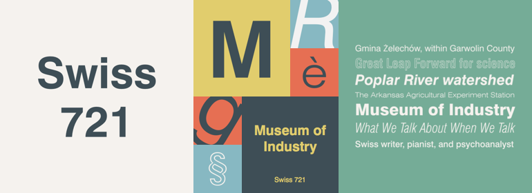
Swiss 721™是一个无衬线字体家族,风格从细体到黑体不等,同时加入了一些意想不到但制作精美,具有讽刺意味却又讨人喜欢的字重,为这个怪诞的设计增添了几分趣味。将这些笔直字形与其相匹配的斜体样式结合在一起,您就拥有了一个漂亮的工具:它能在屏幕上和屏幕外一样清晰,具有技术实力,甚至可以攻克最棘手的设计难题,并可以在无数的项目中发挥作用。Swiss 721是一个基本的无衬线字体,你永远都不会后悔在你的字体库里拥有它。
有人说,简单的无衬线字体是最难设计的字体之一。这是因为当字母缩小到最基本的细节时,设计中的不规则性和不一致性立刻展现。Swiss 721字体家族是字形精华得以提炼而同时仍拥有温暖和神韵的一个典型的例子。
Swiss 721基于世纪中期的无衬线字体,是一个用途广泛的字体家族,其字重和比例非常适合各种印刷和交互设计项目,并且用于广告牌上的标题和在小屏幕上的导航内容同样地驾轻就熟。
Swiss 721粹取20世纪中期无衬线字体的精髓,并融合了现代设计的一致性以及系统化的字重范围。Swiss 721的OpenType®字体也受益于丰富的字符集以及许多支持大多数西欧和许多东欧语言的字形。
Swiss 721™ is a sans serif family that ranges in style from thin to black while mixing in a few unexpected, but beautifully made and ironically flattering, outline weights that spice up the grotesque design. Couple these upstanding letterforms with matching italic styles and you have yourself a beautiful tool that is as legible on screen as it is off, has the technical prowess to conquer even the trickiest of design riddles and will work in a myriad of projects. Swiss 721 is a staple sans serif that you’ll never be sorry you have in your library.
It’s been said that a simple sans serif is one of the most difficult typefaces to design. This is because when letters are reduced to their most basic details, irregularities and inconsistencies in design become immediately visible. The Swiss 721 typeface family is a quintessential example of letterforms distilled to their essence while still possessing warmth and verve.
Based on mid-century sans serif typefaces, Swiss 721 is a versatile family of weights and proportions ideally suited to a wide variety of print and interactive design projects and is equally at home as headlines on billboards as it is navigation content on small screens.
Swiss 721 takes the essence of mid 20th century sans serif typefaces and melds it with modern design consistency and a systematic weight range. OpenType® fonts of Swiss 721 also benefit from a rich character set and a range glyphs supporting most Western European and many Eastern European languages.
No painzno gain pain past is pleasure. One sigh that should be wholly thine.
ABCDEFGHIJKLMNOPQRSTUVWXYZabcdefghijklmnopqrstuvwxyz0123456789@.,:;!?’)]”<>/&-
字体展示

 Bitstream(Monotype)