Uncle Tom's Cabin
Remember what is unbecoming to d
o is also unbecoming to speak of.
授权协议
在使用字体时需要获取字体授权,具体授权包括:
 个人非商业授权
 商业发布授权
 出版物授权:针对出版物
 嵌入式应用授权
如果您的应用场景没有包含在这些授权形式中,请联系我们,我们将为您提供更多选择。
适用系统:Windows/Mac字库安装说明?
基础信息
- 字体品牌:
-
设计师:
Ryan,George
-
字体分类:
无衬线体
-
字体属性:
外文
-
字符集:
Unicode
-
发布时间:
2018

The quick brown fox jumps over a lazy dog
The quick brown fox jumps over a lazy dog
The quick brown fox jumps over a lazy dog

字体介绍
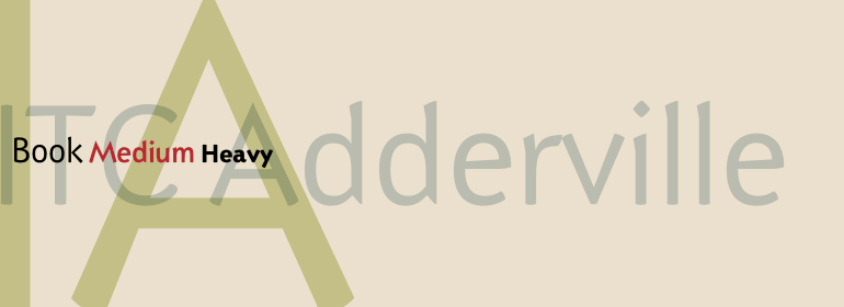
在一个寒冷的冬夜,Galápagos Design Group的George Ryan开始思考一种“真正原始”的无衬线字体的可能性。从他的谈论以及始终存在的画板中,我们可以看到ITC Adderville,这是一种视觉冲击力很强的字体。Ryan解释了他是如何做到的:“笔画的圆形末端和倾斜的基线创造了一种舞步的幻觉。小写字母字干的顶部萌出衬线芽,这意味着向衬线形式过渡或者是脱离衬线形式。像矛一样的小写笔画末端,以及其他一些独特的元素,如小写字母“g”风格化网状结构、以及“i”和“j”上面轮廓清晰的点,都赋予了这个设计趣味性和独特性。其结果是一个友好、活泼的字体家庭,其分级字重——Book、Medium以及Heavy——特别适合在较小的显示尺寸和短文本块中使用。
On a cold winter's night, George Ryan, of Galápagos Design Group, began musing on the possibilities for a “truly original” sans serif typeface. What came out of his musing, and his always-present sketchpad, was ITC Adderville, a typeface whose visual impact is immediate and strong. Ryan explains how he did it: “The rounded ends of its strokes and their skewed baseline contact create an illusion of dancing feet. The tops of lowercase stems emit serif buds, suggesting transition into or out of the serifed form. The spear-like lowercase stroke terminators, along with other distinctive elements such as the stylized reticulation of the lowercase 'g' segments, the salute of that same character's spur, and the bold, non-self-conscious 'i' and 'j' dots, all contribute to the playful and unique nature of this design.” The result is a friendly, lively type family whose graduated weights -- book, medium, and heavy -- lend themselves especially well to use at small display sizes and in short blocks of text.
No painzno gain pain past is pleasure. One sigh that should be wholly thine.
ABCDEFGHIJKLMNOPQRSTUVWXYZabcdefghijklmnopqrstuvwxyz0123456789@.,:;!?’)]”<>/&-
字体展示

 ITC(Monotype)


