Yesterday Once More
I would prefer as friend a good man ignor
ant than one more clever who is evil too.
授权协议
在使用字体时需要获取字体授权,具体授权包括:
 个人非商业授权
 商业发布授权
 出版物授权:针对出版物
 嵌入式应用授权
如果您的应用场景没有包含在这些授权形式中,请联系我们,我们将为您提供更多选择。
适用系统:Windows/Mac字库安装说明?
基础信息
- 字体品牌:
-
设计师:
RubénFontana,YorlmarCampos
-
字体分类:
无衬线体
-
字体属性:
外文
-
字符集:
Unicode
-
发布时间:
2024

The quick brown fox jumps over a lazy dog
The quick brown fox jumps over a lazy dog
The quick brown fox jumps over a lazy dog
The quick brown fox jumps over a lazy dog
The quick brown fox jumps over a lazy dog
The quick brown fox jumps over a lazy dog
The quick brown fox jumps over a lazy dog
The quick brown fox jumps over a lazy dog
The quick brown fox jumps over a lazy dog
The quick brown fox jumps over a lazy dog
The quick brown fox jumps over a lazy dog
The quick brown fox jumps over a lazy dog
The quick brown fox jumps over a lazy dog
The quick brown fox jumps over a lazy dog
The quick brown fox jumps over a lazy dog
The quick brown fox jumps over a lazy dog

字体介绍
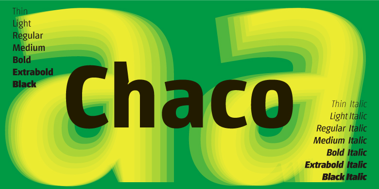
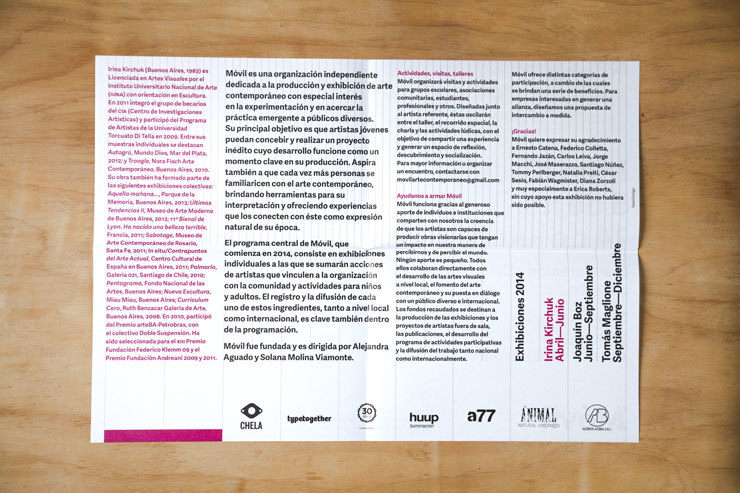
Chaco began as a research project to solve specific wayfinding and roadway signage problems in Argentina, expanding to become a signage system based on the international standards of seven additional countries. Since differentiating between easily-confused signs at a long distance or in small sizes is such a major concern, many of its solutions account for this issue. Chaco was designed with the rare ability to maintain internal space in word composition, offer better performance, and avoid word shortenings that are naturally illegible on a sign, without using the crutch of faux condensation. After solving for large-scale use, great consideration was given to headings and paragraph text to ensure Chaco met a bevy of common scenarios. These refinements include narrower proportions overall, spacious internal angles, and inktraps that are both functional and aesthetic to improve readability. Particular attention was paid to the shape and proportions of the numerals to differentiate them from small caps and capital letters, making alphanumeric strings foolproof. In addition to the traditional ligatures, the ‘ch’ digraph was specially designed since it is a prominent sound in native South American languages. Furthermore, with the intention of optimizing Chaco’s identity and distinction in the font world, some vertical strokes have their weight reversed, which reinforces its memorability. The Chaco family features TypeTogether’s standard Latin character set, with support for over 150 Latin-based languages, including Vietnamese. It has a repertoire of seven weights plus matching italics that increase its ability to compose headlines and texts for mass media, particularly newspapers and periodicals. For those perfectionistic designers and editors who sweat the details, we have included stylistic sets for regular caps and small caps numerals that add serifs to create classic Roman numeral forms. And all the arrows, symbols, icons, and geometric shapes match each of the typographic weights for flawless integration across all media types. Chaco is a full-fledged, multipurpose font created to optimise legibility even in extremely poor reading conditions: distant road signage on foggy days, increased word length in small spaces, memorable branding and identity packages in crowded markets, and reversed-out color printing on imperfect substrates. The bold and contemporary Chaco family has been designed to convincingly succeed where so many other sans serifs flounder.
No painzno gain pain past is pleasure. One sigh that should be wholly thine.
ABCDEFGHIJKLMNOPQRSTUVWXYZabcdefghijklmnopqrstuvwxyz0123456789@.,:;!?’)]”<>/&-
字体展示


 TypeTogether


