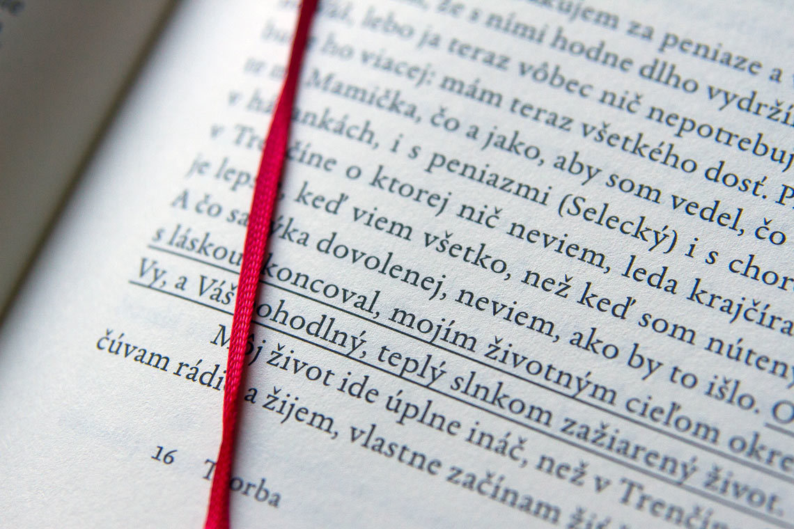
In doing we learn
Ignorant men don't know what good they hold
in their hands until they've flung it away.
授权协议
在使用字体时需要获取字体授权,具体授权包括:
 个人非商业授权
 商业发布授权
 出版物授权:针对出版物
 嵌入式应用授权
如果您的应用场景没有包含在这些授权形式中,请联系我们,我们将为您提供更多选择。
适用系统:Windows/Mac字库安装说明?
基础信息
- 字体品牌:
-
设计师:
Kobayashi,Akira; Gandhi,Kimya
-
字体分类:
无衬线体
-
字体属性:
外文
-
字符集:
Unicode
-
发布时间:
2018

- 拉丁文
- 拉丁文扩展
जननी ज$मभू(म)च +वगा/द1प गर4यसी ॥
- 天城文
- 拉丁文扩展
The quick brown fox jumps over a lazy dog
- 天城文
- 拉丁文
Tħé qüiçk břøŵñ főx júmpš övér á łäżý đòġ
- 拉丁文
- 拉丁文扩展
जननी ज$मभू(म)च +वगा/द1प गर4यसी ॥
- 天城文
- 拉丁文扩展
The quick brown fox jumps over a lazy dog
- 天城文
- 拉丁文
Tħé qüiçk břøŵñ főx júmpš övér á łäżý đòġ
- 拉丁文
- 拉丁文扩展
जननी ज$मभू(म)च +वगा/द1प गर4यसी ॥
- 天城文
- 拉丁文扩展
The quick brown fox jumps over a lazy dog
- 天城文
- 拉丁文
Tħé qüiçk břøŵñ főx júmpš övér á łäżý đòġ
- 拉丁文
- 拉丁文扩展
जननी ज$मभू(म)च +वगा/द1प गर4यसी ॥
- 天城文
- 拉丁文扩展
The quick brown fox jumps over a lazy dog
- 天城文
- 拉丁文
Tħé qüiçk břøŵñ főx júmpš övér á łäżý đòġ
- 拉丁文
- 拉丁文扩展
जननी ज$मभू(म)च +वगा/द1प गर4यसी ॥
- 天城文
- 拉丁文扩展
The quick brown fox jumps over a lazy dog
- 天城文
- 拉丁文
Tħé qüiçk břøŵñ főx júmpš övér á łäżý đòġ

字体介绍
DIN Next以一种不寻常的设计方法给设计者带来了变化,增加了不同的符号和字体的基本形式。在大字号下,细节更加丰富,DIN Next是一个字体系列,灵感来自经典的德国工业工程设计,具有七个字重。每种字重都配有常规、斜体和窄体,使 DIN Next 系列中的字体总数达到 21 种。
自1980年以来,Linotype一直为客户提供两种DIN 1451字体。最近更受欢迎,设计师经常要求额外的字重。
缩写“DIN”代表“Deutsches Institut für Normung e.V.”,即德国工业标准化研究所。1936年,德国标准委员会决定将DIN 1451作为技术,交通,管理和商业领域的标准字体。该设计将用于德国街道标志和门牌号。无衬线会更清晰,更直接,更容易复制。德国标准委员会不打算将设计用于广告和其他以艺术为导向的目的。然而,由于DIN 1451在德国各地的城镇名称和交通方向标志上都可以看到,因此广为人知,成为了平面设计师和广告艺术总监的选择。DIN 1451的数字版本将继续被其他国家的设计师采用和使用,巩固了其在全球的设计声誉。与 DIN 1451 原始版本相比,DIN Next 的字母存在许多细微的差异。这些是由小林添加的,以使新的字族在21世纪的媒体中能发挥更多作用。例如,尽管 DIN 1451 的角都是尖角,但 DIN Next 都略微圆润。
Linotype 的 DIN 1451 Engschrift 和 Mittelschrift 已通过德国 DIN 研究所的认证,可用于官方标牌项目。DIN Next可用于任何其他项目和任何其他国家的工业标牌!DIN Next专为平面设计师量身定制。
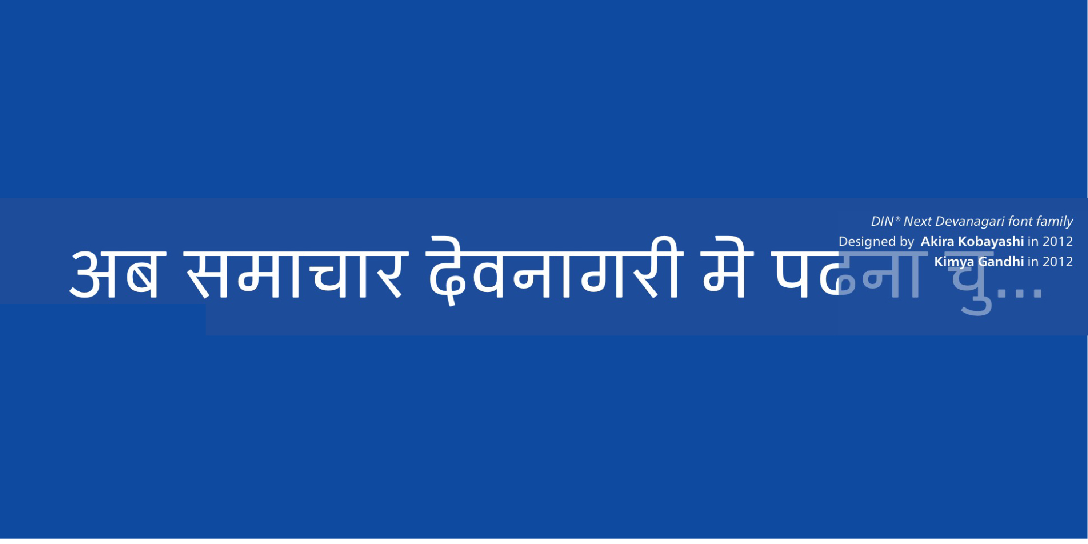
DIN Next系列已经扩展了七个阿拉伯字重和五个梵文字重。网站上显示的梵文字体不会显示字体的所有功能,因此并非所有语言功能都可以正确显示。
DIN Next is a typeface family inspired by the classic industrial German engineering designs, DIN 1451 Engschrift and Mittelschrift. Akira Kobayashi began by revising these two faces-who names just mean "condensed" and "regular" before expanding them into a new family with seven weights (Light to Black). Each weight ships in three varieties: Regular, Italic, and Condensed, bringing the total number of fonts in the DIN Next family to 21. DIN Next is part of Linotype's Platinum Collection. Linotype has been supplying its customers with the two DIN 1451 fonts since 1980. Recently, they have become more popular than ever, with designers regularly asking for additional weights.The abbreviation "DIN" stands for "Deutsches Institut für Normung e.V.", which is the German Institute for Industrial Standardization. In 1936 the German Standard Committee settled upon DIN 1451 as the standard font for the areas of technology, traffic, administration and business. The design was to be used on German street signs and house numbers. The committee wanted a sans serif, thinking it would be more legible, straightforward, and easy to reproduce. They did not intend for the design to be used for advertisements and other artistically oriented purposes. Nevertheless, because DIN 1451 was seen all over Germany on signs for town names and traffic directions, it became familiar enough to make its way onto the palettes of graphic designers and advertising art directors. The digital version of DIN 1451 would go on to be adopted and used by designers in other countries as well, solidifying its worldwide design reputation. There are many subtle differences in DIN Next's letters when compared with DIN 1451 original. These were added by Kobayashi to make the new family even more versatile in 21st-century media. For instance, although DIN 1451's corners are all pointed angles, DIN Next has rounded them all slightly. Even this softening is a nod to part of DIN 1451's past, however. Many of the signs that use DIN 1451 are cut with routers, which cannot make perfect corners; their rounded heads cut rounded corners best. Linotype's DIN 1451 Engschrift and Mittelschrift are certified by the German DIN Institute for use on official signage projects. Since DIN Next is a new design, these applications within Germany are not possible with it. However, DIN Next may be used for any other project, and it may be used for industrial signage in any other country! DIN Next has been tailored especially for graphic designers, but its industrial heritage makes it surprisingly functional in just about any application. The DIN Next family has been extended with seven arabic weights and five Devanagari weights. The display of the Devanagari fonts on the website does not show all features of the font and therefore not all language features may be displayed correctly
No painzno gain pain past is pleasure. One sigh that should be wholly thine.
ABCDEFGHIJKLMNOPQRSTUVWXYZabcdefghijklmnopqrstuvwxyz0123456789@.,:;!?’)]”<>/&-
字体展示

 Monotype