I have a dream of yo
Remember what is unbecoming to d
o is also unbecoming to speak of.
授权协议
在使用字体时需要获取字体授权,具体授权包括:
 个人非商业授权
 商业发布授权
 出版物授权:针对出版物
 嵌入式应用授权
如果您的应用场景没有包含在这些授权形式中,请联系我们,我们将为您提供更多选择。
适用系统:Windows/Mac字库安装说明?
基础信息
- 字体品牌:
-
设计师:
Benton,Morris Fuller
-
字体分类:
哥特体
-
字体属性:
外文
-
字符集:
Unicode
-
发布时间:
2018

- 拉丁文扩展
The quick brown fox jumps over a lazy dog
- 拉丁文
Tħé qüiçk břøŵñ főx júmpš övér á łäżý đòġ

字体介绍
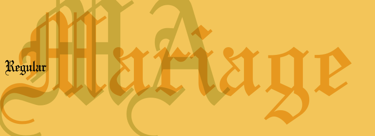
Morris Fuller Benton, the principal designer of the American Type Founders, designed Mariage in 1901. Mariage, which has been sold under a plethora of different names during the last century, is a blackletter typeface belonging to the Old English category. The term blackletter refers to typefaces that stem out of the historical printing traditions of northern Europe. These letters, called gebrochene Schriften, or broken type" in German, are normally elaborately bent and distorted. Their forms often print large amounts of ink upon the page, creating text that leaves a heavy, black impression. The Old English style is a subset of blackletter type that dates back to 1498, when Wynken de Worde introduced textura style printing to England. Continental printers had been printing with textura style letters since Gutenberg's invention of the printing press fifty years earlier. Italian printers stopped using them around 1470. For northern Europeans, texturas remained the most popular form of typeface design until the invention of the fraktur style in Nuremberg. Mariage is heavily classicized sort of Old English type. During the Victorian era, designers admired the Middle Ages for its chivalric, community-based values and its pre-industrial lifestyle. Yet they also found the basic medieval textura letterform too difficult to read by present standards. They desired to modernize this old style. Today, this sort of update is often referred to not as "modernization" but as classicism. Benton's design for ATF builds upon earlier Victorian classicist interpretations of Old English/textura letters. For an example of what these Victorian designs looked like, check out the popular 1990 revival of the genre, Old English . Old English style types often appear drastically different from other blackletters. For contrast, compare Mariage to a classical German fraktur design, Fette Fraktur , a schwabacher style face, or the popular early 20th Century calligraphic gothic from Linotype, Wilhelm Klingspor Gotisch . Especially in the United States, classicist Old English typefaces are thought to espouse tradition and journalistic integrity. These features, together with the inherent, complex beauty of Mariage's forms, make this typeface a perfect choice for certificates, awards, and newsletter mastheads."
No painzno gain pain past is pleasure. One sigh that should be wholly thine.
ABCDEFGHIJKLMNOPQRSTUVWXYZabcdefghijklmnopqrstuvwxyz0123456789@.,:;!?’)]”<>/&-
字体展示

 Linotype(Monotype)