Someone Like You
Friends show their love in time
s of trouble, not in happiness.
授权协议
在使用字体时需要获取字体授权,具体授权包括:
 个人非商业授权
 商业发布授权
 出版物授权:针对出版物
 嵌入式应用授权
如果您的应用场景没有包含在这些授权形式中,请联系我们,我们将为您提供更多选择。
适用系统:Windows/Mac字库安装说明?
基础信息
- 字体品牌:
-
设计师:
McDonald,Rod
-
字体分类:
衬线体
-
字体属性:
外文
-
字符集:
Unicode
-
发布时间:
2018

- 拉丁文扩展
The quick brown fox jumps over a lazy dog
- 拉丁文
Tħé qüiçk břøŵñ főx júmpš övér á łäżý đòġ
- 拉丁文扩展
The quick brown fox jumps over a lazy dog
- 拉丁文
Tħé qüiçk břøŵñ főx júmpš övér á łäżý đòġ
- 拉丁文扩展
The quick brown fox jumps over a lazy dog
- 拉丁文
Tħé qüiçk břøŵñ főx júmpš övér á łäżý đòġ
- 拉丁文扩展
The quick brown fox jumps over a lazy dog
- 拉丁文
Tħé qüiçk břøŵñ főx júmpš övér á łäżý đòġ

字体介绍
1967年1月1日,加拿大百年纪念的开始,通常被认为是该国第一个重要字体的引入日期。这不是一个正确的日期。虽然由加拿大设计师Carl Dair绘制的CG Cartier于1967年1月首次向公众展示,但这更多的是一种字体的创意,而不是字体本身。即使最终在同年秋天生产了字体,它仍然不是最终的设计。
CG Cartier的缺点在于它是刻字而不是字体。刻字和书法可以使字符形状具有个性。但是,在文本字体中,每个字母都必须具有必要的信息,以便容易将其标识为属于该字体。字体设计中最困难的任务是设计仍然带有神韵的并无特色的字母。Dair赋予了CG Cartier独特的个性,使其无法成为一款成功的文本字体。
当另一位加拿大刻字艺术家兼字体设计师Rod McDonald搬到多伦多时,Carl Dair的设计理念如何成为字体设计的故事就开始了。“我去了Mono Lino公司工作,该公司在加拿大拥有CG Cartier的独家经营权。当然,我被这种设计所吸引,并试图经常使用它——但是无法使它作为合适的文本字体使用。”
McDonald会不时地尝试使用CG Cartier,试图将其从刻字转换为字体,但从未成功。然后在20世纪90年代初,发生了一些事情。“我感到自己的职业生涯停滞了。我做了很多文字标记,但渴望做更多。我又看了看CG Cartier。1997年,在英格兰Reread举行的ATypI大会上,我找到了Allan Haley,提出了根据Dair的作品打造数字字体家族的想法。他的鼓励促成了这件事情。”
该项目很快引起了McDonald的激情所在。“我非常熟悉这个设计,并且,多亏多伦多大学梅西学院的帮助,我可以花很多时间来研究Dair's原始草图和更多成品效果图。我开始明白Dair想要达到的效果。我想完成Dair的工作并将他的想法提炼成一个字体设计。”
当被问及他的设计与原始的CG Cartier最重要的区别时,McDonald的回答既简单又直接,并告诉我们怎样才能做出一个成功的字体家族。“Dair的成就在于这个设计。我试图使其成为一款可用的字体。第一年我是这样做的:清理不一致之处,消除怪异的地方;规范基本设计。第二年我把精力投入到字体设计上;把戴尔给它的生命还给它。第二年是最艰难的一年。”
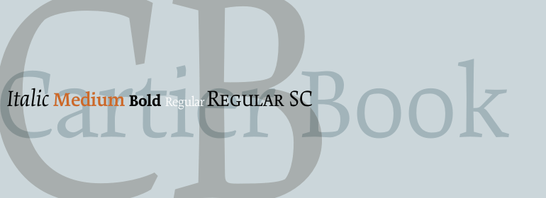
McDonald完成的作品Cartier Book是一个字体家族,包含四个字重,一个Regular字重的斜体补充,小型大写字母——这是一个非凡的设计壮举。它成功地将使字体与众不同的品质与确保持久价值的品质融为一体。很少有设计具有如此优雅的功能以及令人惊叹的吸引力。”
The beginning of Canada's centenary year, January 1, 1967, is generally given as the date for the introduction of that country's first important typeface. This isn't close to the correct date.While CG Cartier, drawn by the Canadian designer Carl Dair, was first shown to the public in January of 1967, this was more an idea for a typeface than a typeface itself. Even when a font was eventually produced in the fall of the same year, it was still not a finished design.
The downfall of CG Cartier is that it is lettering and not a typeface. Lettering and calligraphy allow for individuality in character shapes. In a text typeface, however, each letter must carry the information necessary to easily identify it as belonging to that font. The most difficult task in typeface design is producing an anonymous letter that still possesses verve. The individuality Dair gave CG Cartier precludes it from being a successful text typeface.
The story of how Carl Dair's design idea became a typeface design begins when another Canadian lettering artist and type designer, Rod McDonald, moved to Toronto. I went to work for Mono Lino, the company who had exclusive Canadian rights to CG Cartier. I was, of course, seduced by the design and tried to use it often - but just couldn't make it work as a proper text face."
From time to time, McDonald would experiment with CG Cartier, trying to transform it from lettering to a typeface, never reaching a successful conclusion. Then in the early 1990s something happened. "I felt that my career had plateaued. I was doing a lot of word-marks, but yearned to do more. I looked at CG Cartier again. In 1997, at the ATypI Congress in Reading, England, I approached Allan Haley with the idea of making a digital typeface family based on Dair's work. His encouragement sealed the deal."
The project soon became McDonald's passion. "I was intimately familiar with the design, and, thanks to Massey College of the University of Toronto, was able to spend lots of time with Dair's original sketches and more finished renderings. I began to understand what Dair was trying to accomplish. My goal was to become the drawing office the CG Cartier never had. I wanted to complete Dair's work and distill his idea into a typeface design."
When asked, what is the most significant difference between his design and the original CG Cartier, McDonald's answer was simple, direct and telling of what it takes to make a successful text typeface family. "Dair's accomplishment was the design. I tried to make it a working typeface. I spent the first year doing that: cleaning up the inconsistencies, removing the quirks; basically regularizing the design. The next year was spent putting energy back into the typeface; giving it back the life Dair gave it. The second year was the hardest."
No painzno gain pain past is pleasure. One sigh that should be wholly thine.
ABCDEFGHIJKLMNOPQRSTUVWXYZabcdefghijklmnopqrstuvwxyz0123456789@.,:;!?’)]”<>/&-
字体展示

 Monotype