A light heart lives
Why, I'd like nothing better than to achie
ve some bold adventure, worthy of our trip.
授权协议
在使用字体时需要获取字体授权,具体授权包括:
 个人非商业授权
 商业发布授权
 出版物授权:针对出版物
 嵌入式应用授权
如果您的应用场景没有包含在这些授权形式中,请联系我们,我们将为您提供更多选择。
适用系统:Windows/Mac字库安装说明?
基础信息
- 字体品牌:
-
设计师:
Jean-Baptiste Levée
-
字体分类:
衬线体
-
字体属性:
精品字
-
字符集:
Unicode
-
发布时间:
2018

- 拉丁文扩展
The quick brown fox jumps over a lazy dog
- 拉丁文
Tħé qüiçk břøŵñ főx júmpš övér á łäżý đòġ
- 拉丁文扩展
The quick brown fox jumps over a lazy dog
- 拉丁文
Tħé qüiçk břøŵñ főx júmpš övér á łäżý đòġ
- 拉丁文扩展
The quick brown fox jumps over a lazy dog
- 拉丁文
Tħé qüiçk břøŵñ főx júmpš övér á łäżý đòġ
- 拉丁文扩展
The quick brown fox jumps over a lazy dog
- 拉丁文
Tħé qüiçk břøŵñ főx júmpš övér á łäżý đòġ

字体介绍
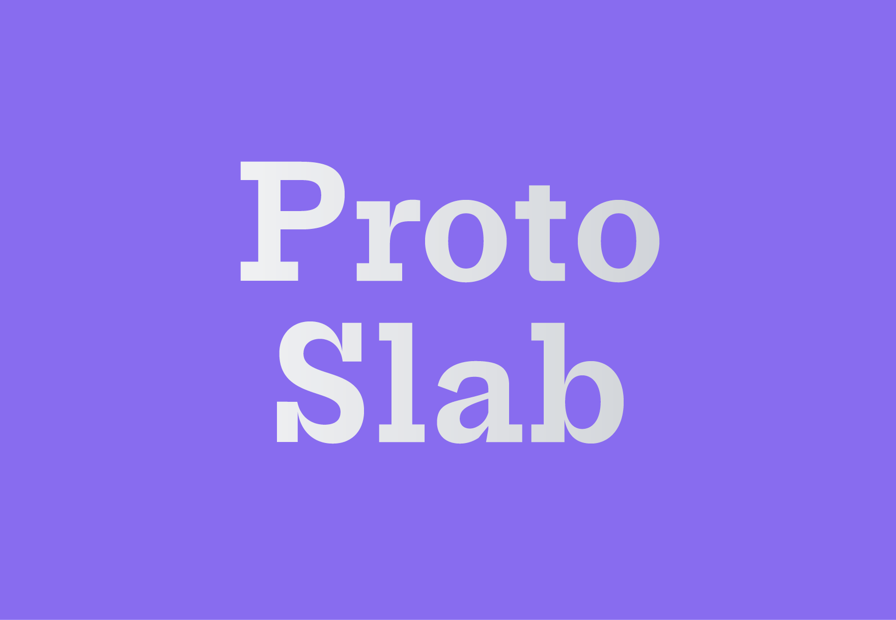
With pinched joints and unpredictable chunky serifs, Proto Slab could be mistaken as a novelty, but that denies its potential as a true workhorse. Like its partner, Proto Sans, this face echoes an era when systematic type families were rare. Instead, new styles and weights were cut as needed, each in their own particular design, related only by vague classification. Referencing “Antiques” from American foundries like Barnhart Bros. & Spindler, Keystone, and MacKellar Smiths & Jordan, Proto Slab wrangles the traditional pre-family jumble into a more cohesive set of fonts, yet the variation between its four weights is still apparent. As the type gains weight serifs fall away (A, C, R, a, w), widths change (J, S), and shapes morph (r, l, t) producing a mix of personalities, each distinct but all sprouting from the same slabby tree. A set of stylistic alternates invites users to manipulate this relationship between fonts, to either normalize or emphasize their differences. Proto Slab, a curious but capable companion to Proto Sans.
No painzno gain pain past is pleasure. One sigh that should be wholly thine.
ABCDEFGHIJKLMNOPQRSTUVWXYZabcdefghijklmnopqrstuvwxyz0123456789@.,:;!?’)]”<>/&-
字体展示
