Gone with the Wind
Hateful to me as are the gates of hell, Is he wh
o, hiding one thing in his heart, Utters another.
授权协议
在使用字体时需要获取字体授权,具体授权包括:
 个人非商业授权
 商业发布授权
 出版物授权:针对出版物
 嵌入式应用授权
如果您的应用场景没有包含在这些授权形式中,请联系我们,我们将为您提供更多选择。
适用系统:Windows/Mac字库安装说明?
基础信息
- 字体品牌:
-
设计师:
Faulhaber,Erik
-
字体分类:
衬线体
-
字体属性:
外文
-
字符集:
Unicode
-
发布时间:
2018

- 拉丁文扩展
The quick brown fox jumps over a lazy dog
- 拉丁文
Tħé qüiçk břøŵñ főx júmpš övér á łäżý đòġ
- 拉丁文扩展
The quick brown fox jumps over a lazy dog
- 拉丁文
Tħé qüiçk břøŵñ főx júmpš övér á łäżý đòġ
- 拉丁文扩展
The quick brown fox jumps over a lazy dog
- 拉丁文
Tħé qüiçk břøŵñ főx júmpš övér á łäżý đòġ
- 拉丁文扩展
The quick brown fox jumps over a lazy dog
- 拉丁文
Tħé qüiçk břøŵñ főx júmpš övér á łäżý đòġ
- 拉丁文扩展
The quick brown fox jumps over a lazy dog
- 拉丁文
Tħé qüiçk břøŵñ főx júmpš övér á łäżý đòġ
- 拉丁文扩展
The quick brown fox jumps over a lazy dog
- 拉丁文
Tħé qüiçk břøŵñ főx júmpš övér á łäżý đòġ
- 拉丁文扩展
The quick brown fox jumps over a lazy dog
- 拉丁文
Tħé qüiçk břøŵñ főx júmpš övér á łäżý đòġ
- 拉丁文扩展
The quick brown fox jumps over a lazy dog
- 拉丁文
Tħé qüiçk břøŵñ főx júmpš övér á łäżý đòġ
- 拉丁文扩展
The quick brown fox jumps over a lazy dog
- 拉丁文
Tħé qüiçk břøŵñ főx júmpš övér á łäżý đòġ
- 拉丁文扩展
The quick brown fox jumps over a lazy dog
- 拉丁文
Tħé qüiçk břøŵñ főx júmpš övér á łäżý đòġ

字体介绍
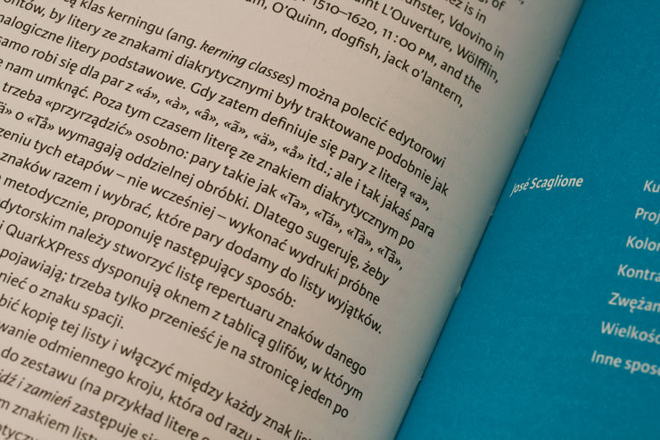
Reduction to the essentials is the design formula employed throughout the whole of the Xenois™ family. Although conventional letter forms are retained, elements that are not absolutely indispensable to facilitate reading flow have been removed. The treatment of the spurs found on the stems of many lower case letters is a characteristic example of this approach. The elimination of these spurs has no effect on quality of legibility while, on the other hand, it gives the letters a very distinctive and characteristic primary form on which Erik Faulhaber has rung the changes in the various Xenois styles. The font has an objective feel as a result of this simplification but is provided with more vitality through the use of rounded punctuation marks. The superb legibility of the clear-cut characters is enhanced by a generous x-height and open counters that are also retained in the bold variants. Every style of Xenois is available in the five weights Light, Regular, Medium, Bold and Heavy. Faulhaber has succeeded in maintaining the precise coordination of stroke weight, contrast, internal spaces and character width within each style and has, at the same time, ensured that stroke weight is harmonised across all the styles. Xenois thus represents a font microcosm within which the various styles can be seamlessly combined with each other.
No painzno gain pain past is pleasure. One sigh that should be wholly thine.
ABCDEFGHIJKLMNOPQRSTUVWXYZabcdefghijklmnopqrstuvwxyz0123456789@.,:;!?’)]”<>/&-
字体展示


 Linotype(Monotype)


