Les Miserables
The comic and the tragic lie insepa
rably close, like light and shadow.
授权协议
在使用字体时需要获取字体授权,具体授权包括:
 个人非商业授权
 商业发布授权
 出版物授权:针对出版物
 嵌入式应用授权
如果您的应用场景没有包含在这些授权形式中,请联系我们,我们将为您提供更多选择。
适用系统:Windows/Mac字库安装说明?
基础信息
- 字体品牌:
-
设计师:
Ford,Jim
-
字体分类:
衬线体
-
字体属性:
外文
-
字符集:
Unicode
-
发布时间:
2018

The quick brown fox jumps over a lazy dog

字体介绍
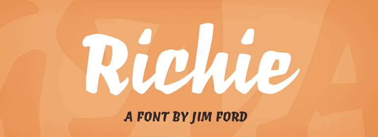
The Richie™ typeface grew out of a lettering experiment inspired by the work of Czech type designer Oldrich Menhart (1897-1962). Menhart’s typefaces were primarily text designs with a strong personal calligraphic influence. Monotype Studio designer, Jim Ford, wondered what a display typeface from Menhart might look like, and began drawing bold script characters with a broad-tipped chisel marker. “It was a familiar but laborious exercise,” explains Ford, “I tried to achieve an authentic – yet controlled – randomness that would serve as the foundation of a typeface.” Ford first drew a large suite of characters using the marker. All the drawings were then carefully adjusted, and scanned. Ford then pieced together a typeface from the best versions of letters, and refined those further. The result is a rugged, somewhat eccentric and playful script built on an obvious hand-drawn foundation. In a world of smooth scripts, the Richie design is heavy, chunky and rough. Its hand-made feel and vigorous rhythm put the power of raw brush lettering into the typographer’s hands. OpenType® fonts of Richie include standard, contextual and discretionary ligatures, in addition to contextual and stylistic alternates, old style, lining and superior figures, plus a large complement of swash characters. The name “Richie”? It grew out of Ford’s original premise for the design. “I wondered what it might it look like if ‘Old Richie’ had designed a heavy display face or script.”
No painzno gain pain past is pleasure. One sigh that should be wholly thine.
ABCDEFGHIJKLMNOPQRSTUVWXYZabcdefghijklmnopqrstuvwxyz0123456789@.,:;!?’)]”<>/&-
字体展示

 Monotype