The Sound and the Fu
If a man is proud of his wealth, he should not
be praised until it is known how he employs it.
授权协议
在使用字体时需要获取字体授权,具体授权包括:
 个人非商业授权
 商业发布授权
 出版物授权:针对出版物
 嵌入式应用授权
如果您的应用场景没有包含在这些授权形式中,请联系我们,我们将为您提供更多选择。
适用系统:Windows/Mac字库安装说明?
基础信息
- 字体品牌:
-
设计师:
Ford,Jim
-
字体分类:
衬线体
-
字体属性:
外文
-
字符集:
Unicode
-
发布时间:
2018

- 拉丁文扩展
The quick brown fox jumps over a lazy dog
- 拉丁文
Tħé qüiçk břøŵñ főx júmpš övér á łäżý đòġ
- 拉丁文扩展
The quick brown fox jumps over a lazy dog
- 拉丁文
Tħé qüiçk břøŵñ főx júmpš övér á łäżý đòġ
- 拉丁文扩展
The quick brown fox jumps over a lazy dog
- 拉丁文
Tħé qüiçk břøŵñ főx júmpš övér á łäżý đòġ
- 拉丁文扩展
The quick brown fox jumps over a lazy dog
- 拉丁文
Tħé qüiçk břøŵñ főx júmpš övér á łäżý đòġ
- 拉丁文扩展
The quick brown fox jumps over a lazy dog
- 拉丁文
Tħé qüiçk břøŵñ főx júmpš övér á łäżý đòġ
- 拉丁文扩展
The quick brown fox jumps over a lazy dog
- 拉丁文
Tħé qüiçk břøŵñ főx júmpš övér á łäżý đòġ
- 拉丁文扩展
The quick brown fox jumps over a lazy dog
- 拉丁文
Tħé qüiçk břøŵñ főx júmpš övér á łäżý đòġ
- 拉丁文扩展
The quick brown fox jumps over a lazy dog
- 拉丁文
Tħé qüiçk břøŵñ főx júmpš övér á łäżý đòġ
- 拉丁文扩展
The quick brown fox jumps over a lazy dog
- 拉丁文
Tħé qüiçk břøŵñ főx júmpš övér á łäżý đòġ
- 拉丁文扩展
The quick brown fox jumps over a lazy dog
- 拉丁文
Tħé qüiçk břøŵñ főx júmpš övér á łäżý đòġ
- 拉丁文扩展
The quick brown fox jumps over a lazy dog
- 拉丁文
Tħé qüiçk břøŵñ főx júmpš övér á łäżý đòġ
- 拉丁文扩展
The quick brown fox jumps over a lazy dog
- 拉丁文
Tħé qüiçk břøŵñ főx júmpš övér á łäżý đòġ
- 拉丁文扩展
The quick brown fox jumps over a lazy dog
- 拉丁文
Tħé qüiçk břøŵñ főx júmpš övér á łäżý đòġ
- 拉丁文扩展
The quick brown fox jumps over a lazy dog
- 拉丁文
Tħé qüiçk břøŵñ főx júmpš övér á łäżý đòġ
- 拉丁文扩展
The quick brown fox jumps over a lazy dog
- 拉丁文
Tħé qüiçk břøŵñ főx júmpš övér á łäżý đòġ
- 拉丁文扩展
The quick brown fox jumps over a lazy dog
- 拉丁文
Tħé qüiçk břøŵñ főx júmpš övér á łäżý đòġ
- 拉丁文扩展
The quick brown fox jumps over a lazy dog
- 拉丁文
Tħé qüiçk břøŵñ főx júmpš övér á łäżý đòġ
- 拉丁文扩展
The quick brown fox jumps over a lazy dog
- 拉丁文
Tħé qüiçk břøŵñ főx júmpš övér á łäżý đòġ
- 拉丁文扩展
The quick brown fox jumps over a lazy dog
- 拉丁文
Tħé qüiçk břøŵñ főx júmpš övér á łäżý đòġ
- 拉丁文扩展
The quick brown fox jumps over a lazy dog
- 拉丁文
Tħé qüiçk břøŵñ főx júmpš övér á łäżý đòġ

字体介绍
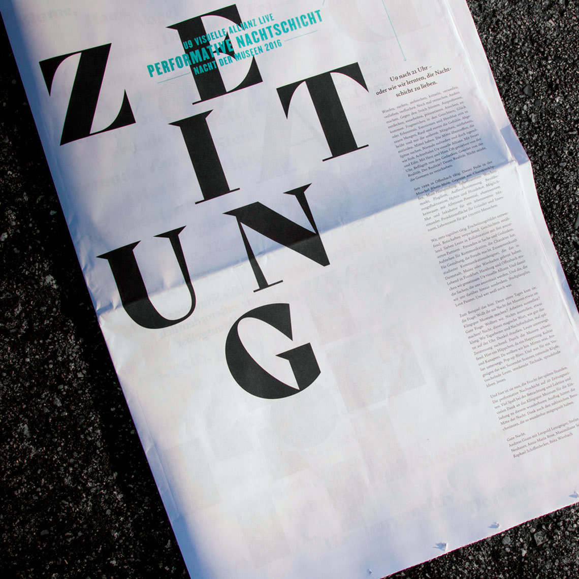
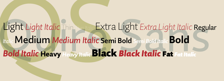
Quire Sans: a universal, humanist sans serif from Jim Ford Jim Ford has put all his experience as a font designer into the new humanist sans serif Quire Sans in order to create a perfect font. Easily legible letters with plenty of character and ten weights make this new font a true polymath. Ford began designing Quire Sans with the intention to create nothing less than the "sans of all sans". After many years of research and experience in font design, as well as the design of countless customer fonts, Ford wanted Quire Sans to be the font he had always imagined, but never dared to start. With Quire Sans, he draws on various epochs of font design, blending Dutch, Italian, French, American and English influences with his personal style. The name itself goes far back in history: "quire" referred to a defined number of pages in medieval book production. As a humanist sans serif, the shapes of Quire Sans are based on Renaissance Antiqua and demonstrate the typical letter forms and variations of this font genre. The "a" is open and the "g" is two story; the one-story version is included as an alternative character . Carefully, almost invisibly slanted terminals on the stems, legs that curve outwards slightly on the uppercase "M" and round dots take off some of the formal edge of Quire Sans and lend the font a loose, almost joyful character. Another detail supports this font personality: The diagonal arms - in "k", "A", "K" and "R", for example - are cut so as to be on a slight angle and only touch the ascender line with a point, appearing as if they were taking a step. Ford is very careful not only with the design of the letters, but also with the selection of characters. Quire Sans has character sets with medieval and upper-case characters, aimed at table and proportional setting. Moreover, there are small caps, numerous f ligatures, an alternative &-character and the fleuron. Each of the subtly graded weights of Quire Sans has true italic styles that draw on the Antiqua even more. Here, numerous letters have a light, curved, dynamic shape, like the "k", "v", "y" or "z", for example. The lower-case "a" changes to a closed shape, the "f" gets a descender and the "g" switches to the one-story variant - the two-story "g" is still available in the alternative characters, however. Quire Sans lives up to its aspirations of being a good reading font (which the name itself implies). It is perfectly legible, even in the smaller sizes. Quire Sans is more than a book font, however. With the extensive selection of weights, it is also a great font for headlines and printing jobs. Depending on the context and the weight, Quire Sans can appear subtle, robust or graceful. The font can also do well in the difficult contexts of guidance systems or newspapers. As a universal sans serif, Quire Sans is the ideal partner for large projects and corporate type.
No painzno gain pain past is pleasure. One sigh that should be wholly thine.
ABCDEFGHIJKLMNOPQRSTUVWXYZabcdefghijklmnopqrstuvwxyz0123456789@.,:;!?’)]”<>/&-
字体展示

 Monotype