To you unexpected pe
There are times when fear is good. It must ke
ep its watchful place at the heart's controls.
授权协议
在使用字体时需要获取字体授权,具体授权包括:
 个人非商业授权
 商业发布授权
 出版物授权:针对出版物
 嵌入式应用授权
如果您的应用场景没有包含在这些授权形式中,请联系我们,我们将为您提供更多选择。
适用系统:Windows/Mac字库安装说明?
基础信息
- 字体品牌:
-
设计师:
Veljovic,Jovica
-
字体分类:
衬线体
-
字体属性:
外文
-
字符集:
Unicode
-
发布时间:
2018

- 拉丁文扩展
The quick brown fox jumps over a lazy dog
- 拉丁文
Tħé qüiçk břøŵñ főx júmpš övér á łäżý đòġ
- 拉丁文扩展
The quick brown fox jumps over a lazy dog
- 拉丁文
Tħé qüiçk břøŵñ főx júmpš övér á łäżý đòġ
- 拉丁文扩展
The quick brown fox jumps over a lazy dog
- 拉丁文
Tħé qüiçk břøŵñ főx júmpš övér á łäżý đòġ
- 拉丁文扩展
The quick brown fox jumps over a lazy dog
- 拉丁文
Tħé qüiçk břøŵñ főx júmpš övér á łäżý đòġ
- 拉丁文扩展
The quick brown fox jumps over a lazy dog
- 拉丁文
Tħé qüiçk břøŵñ főx júmpš övér á łäżý đòġ
- 拉丁文扩展
The quick brown fox jumps over a lazy dog
- 拉丁文
Tħé qüiçk břøŵñ főx júmpš övér á łäżý đòġ
- 拉丁文扩展
The quick brown fox jumps over a lazy dog
- 拉丁文
Tħé qüiçk břøŵñ főx júmpš övér á łäżý đòġ
- 拉丁文扩展
The quick brown fox jumps over a lazy dog
- 拉丁文
Tħé qüiçk břøŵñ főx júmpš övér á łäżý đòġ
- 拉丁文扩展
The quick brown fox jumps over a lazy dog
- 拉丁文
Tħé qüiçk břøŵñ főx júmpš övér á łäżý đòġ
- 拉丁文扩展
The quick brown fox jumps over a lazy dog
- 拉丁文
Tħé qüiçk břøŵñ főx júmpš övér á łäżý đòġ
- 拉丁文扩展
The quick brown fox jumps over a lazy dog
- 拉丁文
Tħé qüiçk břøŵñ főx júmpš övér á łäżý đòġ
- 拉丁文扩展
The quick brown fox jumps over a lazy dog
- 拉丁文
Tħé qüiçk břøŵñ főx júmpš övér á łäżý đòġ
- 拉丁文扩展
The quick brown fox jumps over a lazy dog
- 拉丁文
Tħé qüiçk břøŵñ főx júmpš övér á łäżý đòġ
- 拉丁文扩展
The quick brown fox jumps over a lazy dog
- 拉丁文
Tħé qüiçk břøŵñ főx júmpš övér á łäżý đòġ
- 拉丁文扩展
The quick brown fox jumps over a lazy dog
- 拉丁文
Tħé qüiçk břøŵñ főx júmpš övér á łäżý đòġ
- 拉丁文扩展
The quick brown fox jumps over a lazy dog
- 拉丁文
Tħé qüiçk břøŵñ főx júmpš övér á łäżý đòġ
- 拉丁文扩展
The quick brown fox jumps over a lazy dog
- 拉丁文
Tħé qüiçk břøŵñ főx júmpš övér á łäżý đòġ
- 拉丁文扩展
The quick brown fox jumps over a lazy dog
- 拉丁文
Tħé qüiçk břøŵñ főx júmpš övér á łäżý đòġ
- 拉丁文扩展
The quick brown fox jumps over a lazy dog
- 拉丁文
Tħé qüiçk břøŵñ főx júmpš övér á łäżý đòġ
- 拉丁文扩展
The quick brown fox jumps over a lazy dog
- 拉丁文
Tħé qüiçk břøŵñ főx júmpš övér á łäżý đòġ
- 拉丁文扩展
The quick brown fox jumps over a lazy dog
- 拉丁文
Tħé qüiçk břøŵñ főx júmpš övér á łäżý đòġ
- 拉丁文扩展
The quick brown fox jumps over a lazy dog
- 拉丁文
Tħé qüiçk břøŵñ főx júmpš övér á łäżý đòġ
- 拉丁文扩展
The quick brown fox jumps over a lazy dog
- 拉丁文
Tħé qüiçk břøŵñ főx júmpš övér á łäżý đòġ
- 拉丁文扩展
The quick brown fox jumps over a lazy dog
- 拉丁文
Tħé qüiçk břøŵñ főx júmpš övér á łäżý đòġ
- 拉丁文扩展
The quick brown fox jumps over a lazy dog
- 拉丁文
Tħé qüiçk břøŵñ főx júmpš övér á łäżý đòġ
- 拉丁文扩展
The quick brown fox jumps over a lazy dog
- 拉丁文
Tħé qüiçk břøŵñ főx júmpš övér á łäżý đòġ
- 拉丁文扩展
The quick brown fox jumps over a lazy dog
- 拉丁文
Tħé qüiçk břøŵñ főx júmpš övér á łäżý đòġ
- 拉丁文扩展
The quick brown fox jumps over a lazy dog
- 拉丁文
Tħé qüiçk břøŵñ főx júmpš övér á łäżý đòġ
- 拉丁文扩展
The quick brown fox jumps over a lazy dog
- 拉丁文
Tħé qüiçk břøŵñ főx júmpš övér á łäżý đòġ
- 拉丁文扩展
The quick brown fox jumps over a lazy dog
- 拉丁文
Tħé qüiçk břøŵñ főx júmpš övér á łäżý đòġ

字体介绍
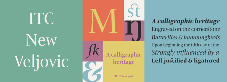
ITC New Veljovic: Optimization and extension of a classic font by Jovica Veljovi? Thirty years after its first appearance, Prof. Jovica Veljovi? has produced ITC New Veljovic, a revised version of his first typeface. Skillfully enhanced character forms give the new font a particularly harmonious effect while the extensive additions open up new potential applications for this versatile, readily legible typeface. In view of the many and highly successful fonts that Veljovi? has published to date it is surprising in hindsight that, although he discovered his love of calligraphy and manuscripts after studying at the Belgrade University of Arts, the design of printing type did not at first appeal to him. It was only on the advice of his mentor Henri Friedlaender, the eminent Israeli typographer, and when an invitation to visit him in his New York studio arrived from Aaron Burns, one of the founders of ITC, that Veljovi? came into contact with type design. He can still clearly remember meeting Burns in his office, where his desk was covered by type specimens. At this point, Veljovi? began to wonder how on Earth it would be possible to create something new given the existence of this already considerable diversity. Despite these misgivings, Veljovi? accepted the commission to design a new font for ITC and returned to Serbia where he began to teach himself typeface design. Just over 12 months later, he sent his designs to New York and his first font, ITC Veljovic, was published in 1984. This antiqua font is characterized by its triangular, sharply pointed serifs that, together with the clearly defined forms, give the impression that the characters have been carved in stone. The uppercase letters have a Roman elegance and monumental grandeur. Calligraphic details are subtly distributed throughout the typeface and provide an interesting contrast to the more formal architecture. More than 30 years after its initial publication, Veljovi? came to believe it was time to revise the font that bears his name. He has used all the experience he has garnered over the past decades and by carefully adjusting the proportions of the characters he has provided the new typeface with a more harmonious presence. The serifs have also been slightly curtailed and the letters made more condensed. Immediately striking in the case of ITC New Veljovic are, for example, the double-story "g" with its completely closed loop and the more open forms of the "c" and "e". In the italic variants, the latter is much rounder. Characters with unusually extended ascenders and descenders are made available to the standard versions through a format set and can be used to emphasize the elegance of ITC New Veljovic. Veljovi? has also extensively added to his font. ITC New Veljovic offers a Regular weight that supplements the four existing styles from Book to Medium. Moreover, Veljovi? has designed variants with reduced tracking and a display version with spacing and contrast that take account of the special requirements of setting text in larger point sizes. All variants are accompanied by genuine italic versions. The range of glyphs not only covers the needs of most Western and Eastern European languages, but also includes oldstyle and lining figures, small caps and numerous ligatures. The format sets help with the conversion of Latin characters to Cyrillic characters and vice versa. Jovica Veljovi? has done an outstanding job so that the optimized and considerably extended versatile font ITC New Veljovic can now be used in new applications. The new Condensed style saves considerable space when it comes to setting longer texts and the Display versions show off the crystal-clear forms of ITC New Veljovic at their best in larger point sizes. The stable serifs not only enhance the effect of ITC New Veljovic in print but also give it a well-defined and readily legible appearance in images and when used as a web font.
No painzno gain pain past is pleasure. One sigh that should be wholly thine.
ABCDEFGHIJKLMNOPQRSTUVWXYZabcdefghijklmnopqrstuvwxyz0123456789@.,:;!?’)]”<>/&-
字体展示

 ITC(Monotype)