The Da Vinci Code
Quickly, bring me a beaker of wine, so that
I may wet my mind and say something clever.
授权协议
在使用字体时需要获取字体授权,具体授权包括:
 个人非商业授权
 商业发布授权
 出版物授权:针对出版物
 嵌入式应用授权
如果您的应用场景没有包含在这些授权形式中,请联系我们,我们将为您提供更多选择。
适用系统:Windows/Mac字库安装说明?
基础信息
- 字体品牌:
-
设计师:
Nix,Charles
-
字体分类:
衬线体
-
字体属性:
外文
-
字符集:
Unicode
-
发布时间:
2018

- 拉丁文扩展
The quick brown fox jumps over a lazy dog
- 拉丁文
Tħé qüiçk břøŵñ főx júmpš övér á łäżý đòġ
- 拉丁文扩展
The quick brown fox jumps over a lazy dog
- 拉丁文
Tħé qüiçk břøŵñ főx júmpš övér á łäżý đòġ
- 拉丁文扩展
The quick brown fox jumps over a lazy dog
- 拉丁文
Tħé qüiçk břøŵñ főx júmpš övér á łäżý đòġ
- 拉丁文扩展
The quick brown fox jumps over a lazy dog
- 拉丁文
Tħé qüiçk břøŵñ főx júmpš övér á łäżý đòġ
- 拉丁文扩展
The quick brown fox jumps over a lazy dog
- 拉丁文
Tħé qüiçk břøŵñ főx júmpš övér á łäżý đòġ
- 拉丁文扩展
The quick brown fox jumps over a lazy dog
- 拉丁文
Tħé qüiçk břøŵñ főx júmpš övér á łäżý đòġ
- 拉丁文扩展
The quick brown fox jumps over a lazy dog
- 拉丁文
Tħé qüiçk břøŵñ főx júmpš övér á łäżý đòġ
- 拉丁文扩展
The quick brown fox jumps over a lazy dog
- 拉丁文
Tħé qüiçk břøŵñ főx júmpš övér á łäżý đòġ
- 拉丁文扩展
The quick brown fox jumps over a lazy dog
- 拉丁文
Tħé qüiçk břøŵñ főx júmpš övér á łäżý đòġ
- 拉丁文扩展
The quick brown fox jumps over a lazy dog
- 拉丁文
Tħé qüiçk břøŵñ főx júmpš övér á łäżý đòġ
- 拉丁文扩展
The quick brown fox jumps over a lazy dog
- 拉丁文
Tħé qüiçk břøŵñ főx júmpš övér á łäżý đòġ
- 拉丁文扩展
The quick brown fox jumps over a lazy dog
- 拉丁文
Tħé qüiçk břøŵñ főx júmpš övér á łäżý đòġ

字体介绍
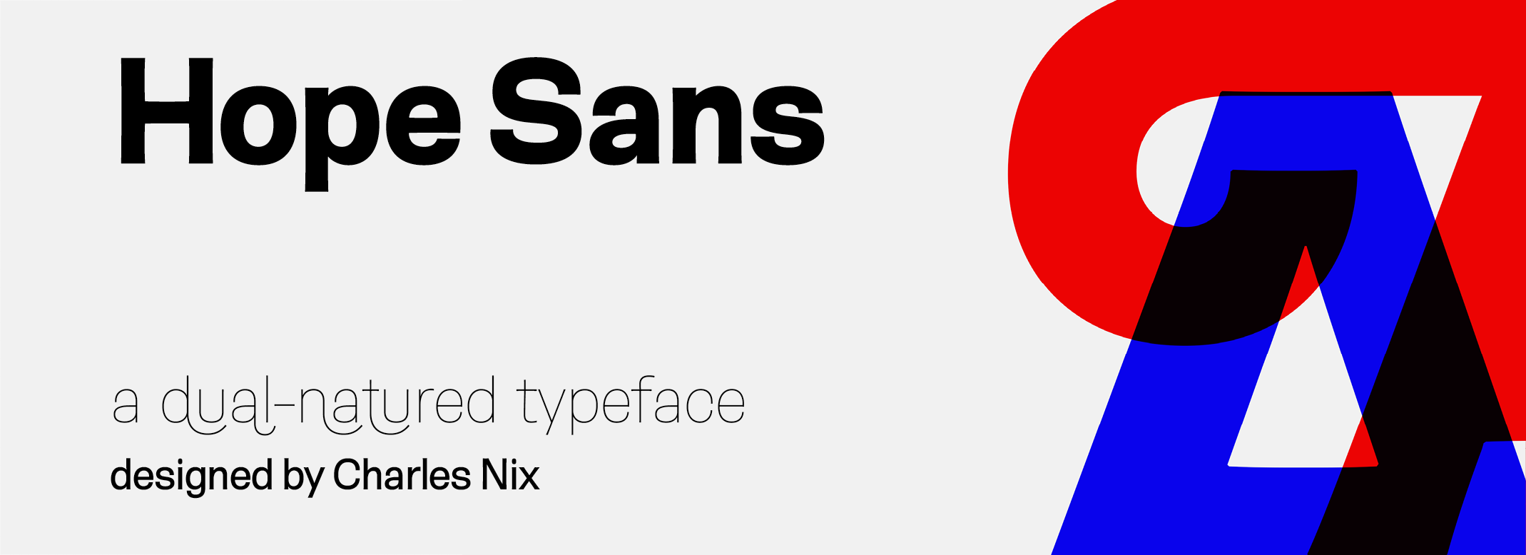
A boatload of personality and a riot of swash characters make the Hope Sans ™ typeface an excellent display family. But this is a dual-purpose face. Hope Sans also does double-duty as a good-natured text design. Every cap letter has at least two swash alternatives, and some as many as six. Several lowercase characters also have swash or alternate characters. Ligatures abound. Underlying all this typographic merriment is a cheerful sans serif design in six weights, each with a cursive italic companion. The result is a typographic paint box that can be used for everything from branding to packaging, and advertising to editorial design. Headlines, subheads, banners and navigational links are naturals for Hope Sans’ lightest and boldest weights – either with, or without, the swash letters. The mid-range weights of the family shine in smaller sizes and in blocks of inviting text copy. Their friendly vibe also translates well to web and interactive design projects. Spacing is open, counters are large, and Hope Sans’ range of weights can provide just the right design for virtually any need. Charles Nix drew on two sources when he began his first sketches for Hope Sans. “I was looking at lettering for inspiration – specifically lettering from the middle of the last century,” explains Nix. “The thing that grabbed me was the relaxed nature of hand lettered forms based on traditional typographic models. I wondered if I could capture some of that spirit and make a lively grotesque.” Nix, however, did not stop there, He wanted to create a design that was more than “just another grotesque.” Hope Sans takes the jaunty style of 1950s and 60s sans serif lettering and combines it with the jubilant 1970s swashes of Bookman and Caslon. The result is a sans serif family that is vivacious and affable. Stems flair, bowls lean ever so slightly to the right, and corners are softened, animating the font with a subtle bounce. Nix is an American designer, typographer, and educator. He has designed hundreds of books and typefaces; and for more than 20 years, has taught at the Parsons School of Design, where he has served as Chairman of Communication Design. He is also chairman emeritus of the board of the Type Directors Club and a Senior Type Designer at Monotype.
No painzno gain pain past is pleasure. One sigh that should be wholly thine.
ABCDEFGHIJKLMNOPQRSTUVWXYZabcdefghijklmnopqrstuvwxyz0123456789@.,:;!?’)]”<>/&-
字体展示

 Monotype