Won gold in a kind
Be kind, for everyone you me
et is fighting a hard battle.
授权协议
在使用字体时需要获取字体授权,具体授权包括:
 个人非商业授权
 商业发布授权
 出版物授权:针对出版物
 嵌入式应用授权
如果您的应用场景没有包含在这些授权形式中,请联系我们,我们将为您提供更多选择。
适用系统:Windows/Mac字库安装说明?
基础信息
- 字体品牌:
-
设计师:
Faulhaber,Erik
-
字体分类:
衬线体
-
字体属性:
外文
-
字符集:
Unicode
-
发布时间:
2018

- 拉丁文扩展
The quick brown fox jumps over a lazy dog
- 拉丁文扩展
The quick brown fox jumps over a lazy dog
- 拉丁文
- 拉丁文
Tħé qüiçk břøŵñ főx júmpš övér á łäżý đòġ
- 拉丁文扩展
The quick brown fox jumps over a lazy dog
- 拉丁文扩展
The quick brown fox jumps over a lazy dog
- 拉丁文
- 拉丁文
Tħé qüiçk břøŵñ főx júmpš övér á łäżý đòġ
- 拉丁文扩展
The quick brown fox jumps over a lazy dog
- 拉丁文扩展
The quick brown fox jumps over a lazy dog
- 拉丁文
- 拉丁文
Tħé qüiçk břøŵñ főx júmpš övér á łäżý đòġ
- 拉丁文扩展
The quick brown fox jumps over a lazy dog
- 拉丁文扩展
The quick brown fox jumps over a lazy dog
- 拉丁文
- 拉丁文
Tħé qüiçk břøŵñ főx júmpš övér á łäżý đòġ
- 拉丁文扩展
The quick brown fox jumps over a lazy dog
- 拉丁文扩展
The quick brown fox jumps over a lazy dog
- 拉丁文
- 拉丁文
Tħé qüiçk břøŵñ főx júmpš övér á łäżý đòġ
- 拉丁文扩展
The quick brown fox jumps over a lazy dog
- 拉丁文
Tħé qüiçk břøŵñ főx júmpš övér á łäżý đòġ
- 拉丁文扩展
The quick brown fox jumps over a lazy dog
- 拉丁文扩展
The quick brown fox jumps over a lazy dog
- 拉丁文
- 拉丁文
Tħé qüiçk břøŵñ főx júmpš övér á łäżý đòġ
- 拉丁文扩展
The quick brown fox jumps over a lazy dog
- 拉丁文
Tħé qüiçk břøŵñ főx júmpš övér á łäżý đòġ
- 拉丁文扩展
The quick brown fox jumps over a lazy dog
- 拉丁文扩展
The quick brown fox jumps over a lazy dog
- 拉丁文
- 拉丁文
Tħé qüiçk břøŵñ főx júmpš övér á łäżý đòġ
- 拉丁文扩展
The quick brown fox jumps over a lazy dog
- 拉丁文
Tħé qüiçk břøŵñ főx júmpš övér á łäżý đòġ
- 拉丁文扩展
The quick brown fox jumps over a lazy dog
- 拉丁文扩展
The quick brown fox jumps over a lazy dog
- 拉丁文
- 拉丁文
Tħé qüiçk břøŵñ főx júmpš övér á łäżý đòġ
- 拉丁文扩展
The quick brown fox jumps over a lazy dog
- 拉丁文
Tħé qüiçk břøŵñ főx júmpš övér á łäżý đòġ

字体介绍
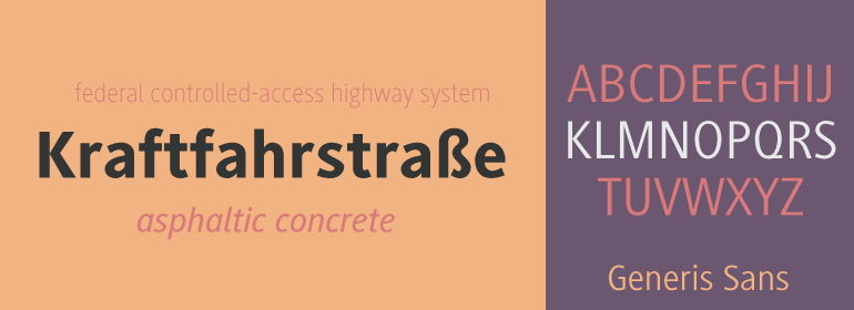
The idea for the Generis type system came to Erik Faulhaber while he was traveling in the USA. Seeing typefaces mixed together in a business district motivated him to create a new type system with interrelated forms. The first design scheme came about in 1997, following the space saving model of these American Gothics. Faulhaber then examined the demands of legibility and various communications media before finally developing the plan behind this type system. Generis's design includes two individually designed styles; each of with is available with and without serifs, giving the type system four separate families. Each includes at least four basic weights: Light, Regular, Medium, and Bold. Further weights, small caps, old style figures, and true italics were added to each family where needed. The Generis type system is designed to meet both optical criteria and the highest possible measure of technical precision. Harmony, rhythm, legibility, and formal restraint make up the foreground. Generis combines aesthetic, technical, and economic advantages, which purposefully and efficiently cover the whole range of corporate communication needs. The unified basic form and the individual peculiarity of the styles lead to Generis' systematic, total-package concept. The clear formal language of the Generis type system resides beneath the information, bringing appropriate typographic expression to high-level corporate identity systems, both in print and on screen. The condensed and aspiring nature of the letterforms allows for the efficient setting of body copy, and the economic use of the page. A range of accented characters allows text to be set in 48 Latin-based languages, offering maximal typographic free range. This previously unknown level of technical and design execution helps create higher quality typography in all areas of corporate communication. Optimal combinations within the type system: Generis Serif or Generis Slab with Generis Sans or Generis Simple.
No painzno gain pain past is pleasure. One sigh that should be wholly thine.
ABCDEFGHIJKLMNOPQRSTUVWXYZabcdefghijklmnopqrstuvwxyz0123456789@.,:;!?’)]”<>/&-
字体展示

 Linotype(Monotype)